comfytea
patreon
Hi everyone, hope you're doing well.
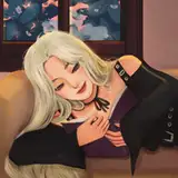
As the heading says, I'm trying out a new thumbnail format for the new year. Although the thumbnail for the upcoming video has been determined, I wanted to get your opinion on which one you think is better/find more aesthetically pleasing.
Please let me know your thoughts in the comments. The more honest, the better.
Thank you so much for reading, take care.


I like one on the left with dark background and white text.
I like the orange/darker background for the white text. The contrast makes it pop a bit more. But I am digging the logo on the 2nd one
Left looks more natural and relaxing like ASMR should be, right is more sterile and hard
Left works better gives off a more alluring atmosphere then the right
Left looks really nice and is more eye catching due to the contrast of the character and the background
I like the font of the first picture but the second one is a bit more "oomph"
I like the first one more, but with the main title style of the 2nd.
I kind of like the right option a little bit more
The one on the left I love alot more as the background has more natural colors making the character pop out and stand out Abit more making her presence known were the one on the right she some what blends in with the background instead
Number 1. It seems soft.