eunzel
patreon
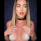
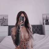
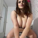
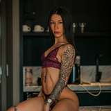
이불텐트 안 모습인데, 어떤 썸네일이 더 끌리나요? 색감에 대한 의견도 같이 부탁해요 :)
Inside pillowfort, which one you like more? Opinions about the color grading is welcome too.


I like the 1st one better :)
Personally I think the brightest and clearest thumbnail is most easily noticeable next to all other thumbnails on the youtube page :) Maybe if the darker cozy colors could impress in the thumbnail preview footage, it might be the best mix of both light and dark?
first one color graded to second one
color on the second one is warmer, makes it bit more comfy for me.
I agree with Yann and Dio. I prefer the focus in the first one, but the color grading from the 2nd one. If you can change the color of the first one to look like the 2nd one, that would be perfect.
1st one, but grade it more like the second one.
저는 1번이유.... 엄머나 세상 예쁘셔라... 전 2번이 따듯한 톤 보다 그냥 좀 어두운거 같아서요 ㅎㅎ.
I like the 1st one. But the 2nd have warmer colors, maybe more fitting for a thumbmail :)
#2, the warm colors makes it feel more cozy and intimate.
2번이 더 좋은거 같아요 1번도 색이 투명하고 좋지만 2번이 색온도가 따뜻하고 분위기가 좋은거 같아요
The second 😊
텐트같은느낌은 2번
The 1st one
전 2번이요ㅎㅎ 색감이 더 따뜻한 느낌이에요
The dead puppet is cool and subtly frightening but I choose the 2. one. Also, Steven Vincent is right.
The first is more cute and inviting. The second is more sexy and alluring.
I'm liking the 1st pic.
이불텐트 안쪽 모습이면 2번이 따뜻해보이는 색감도 그렇고 더 잘어울리는거 같아요. 1번은 이불텐트 안쪽보다는 일반침대 위 같은 느낌?
Vote #2 :D coloring is warmer.